I mentioned some of the feedback I received from the first critique of term in this post. The task during the week following was to use those suggestions and criticisms.
I experimented with and modified work from the spring critique in five different ways. The more I thought about the spring crit, the more I saw a spectrum of ideas ranging from small modifications to 2D images to their incorporation into 3D installations or books.
1) A tunnel book, which uses an accordion fold to provide structure.
I cut up one of my imperfect Princess Wig paintings. Each princess’s wig had its own page. Looking through the peephole at the front of the book let you see more recent princess wigs clearest (since they followed reverse chronological order.)
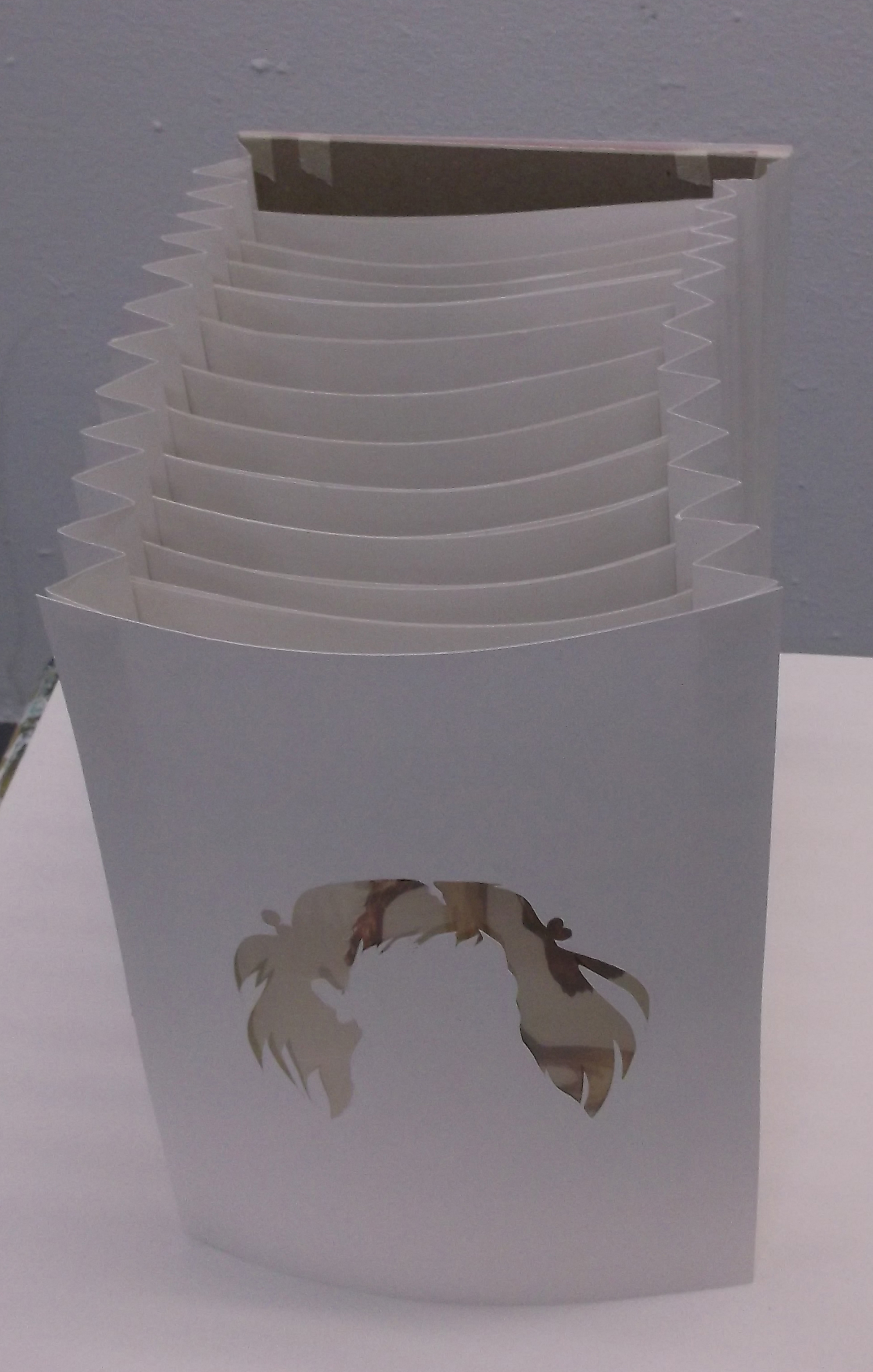
Verdict: no
This requires a lot of time and repetitive work. The peephole format is intriguing because it forces viewers to modify their own point of view to suit it. It is also rather like a one-liner, when what I want is a full blend of seriousness and comedy that supports nuance.
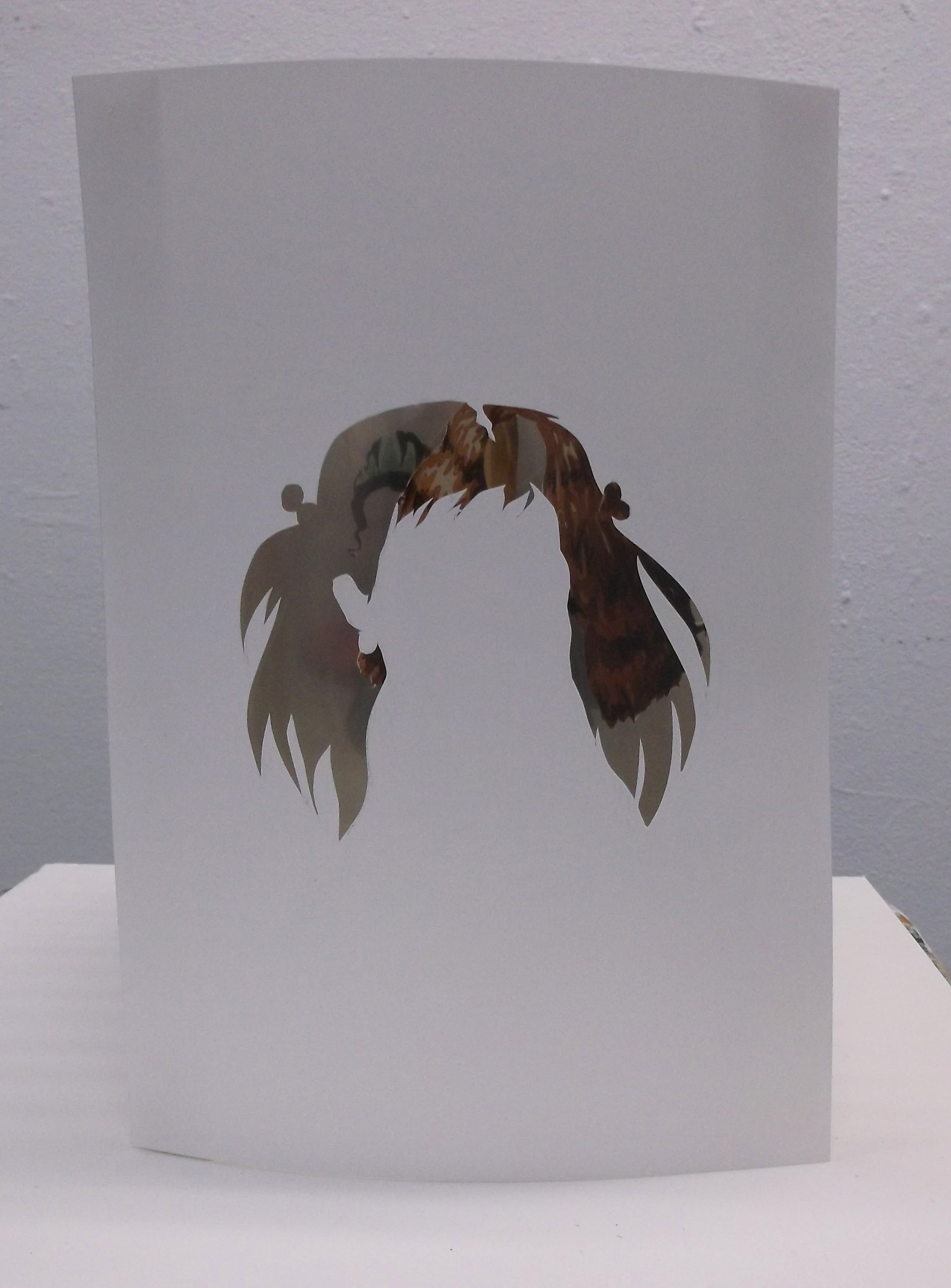
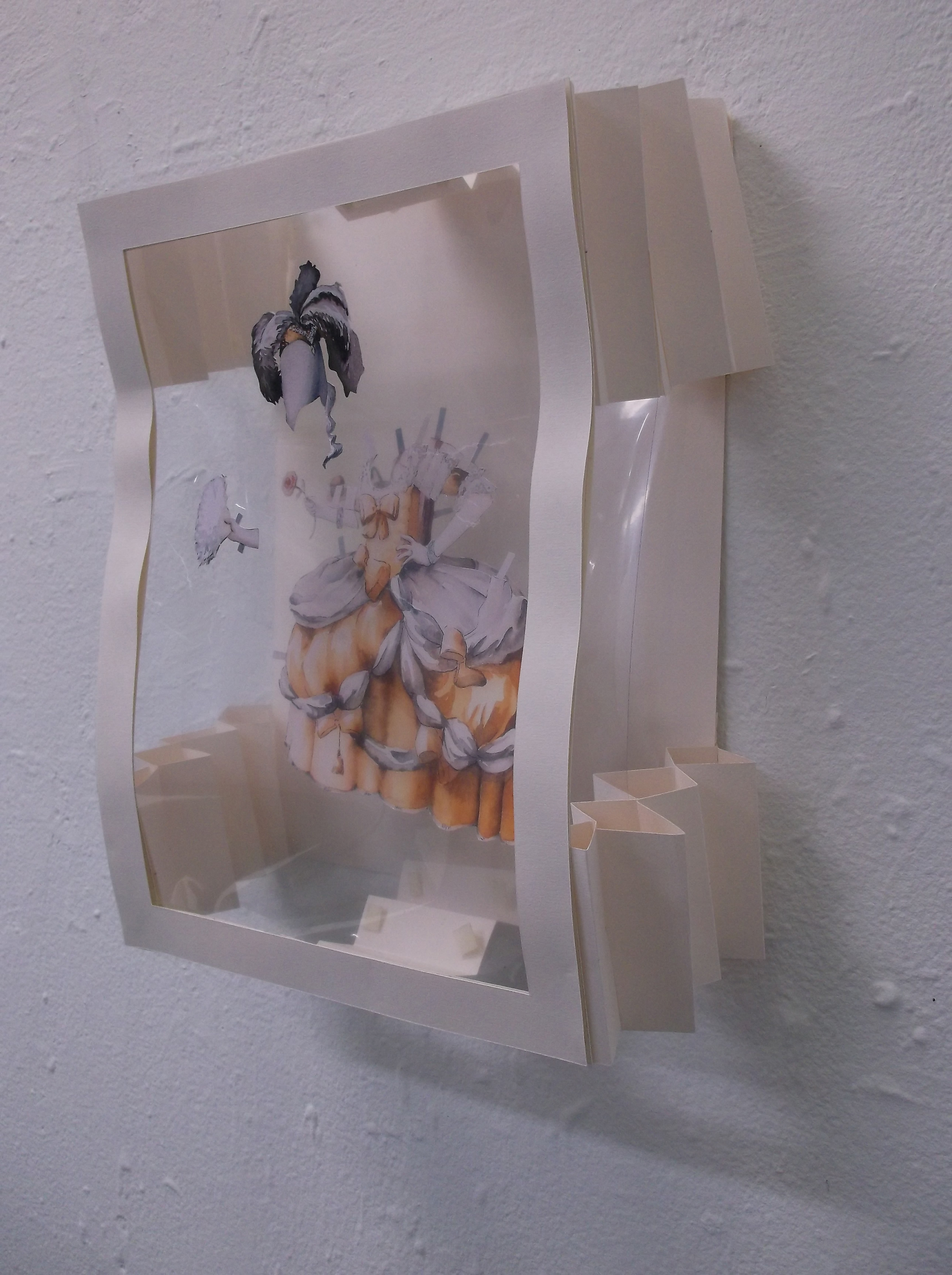
2) Court dress installation
This is merely a maquette. For it to work properly, this structure would need more support (such as thicker paper on the front panel or even mat board). The accordion folds were goofy, and didn’t go over particularly well.
Verdict: nope
The positive side of things is that adorable wavering body language that viewers adopt in front of this kind of work. Like an optical illusion, we try to see two images simultaneously (and almost manage it).
The layered format works well for this historical costuming topic, but few of my other doll costumes line up so perfectly. I don’t feel it would suit the series as a whole.
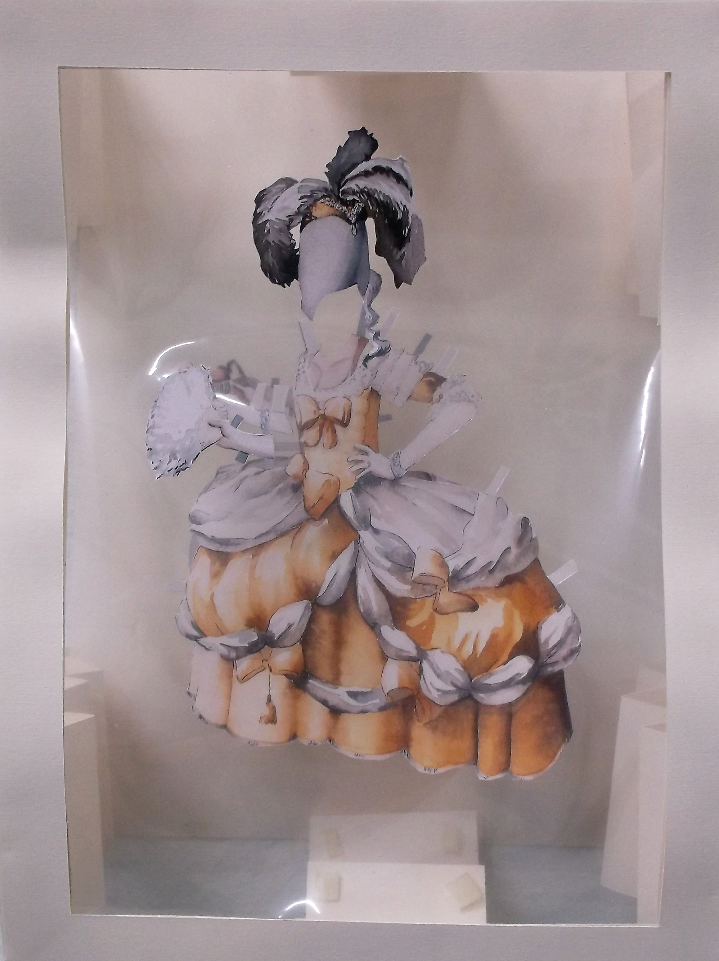
3) Jessica Rabbit pinup popup
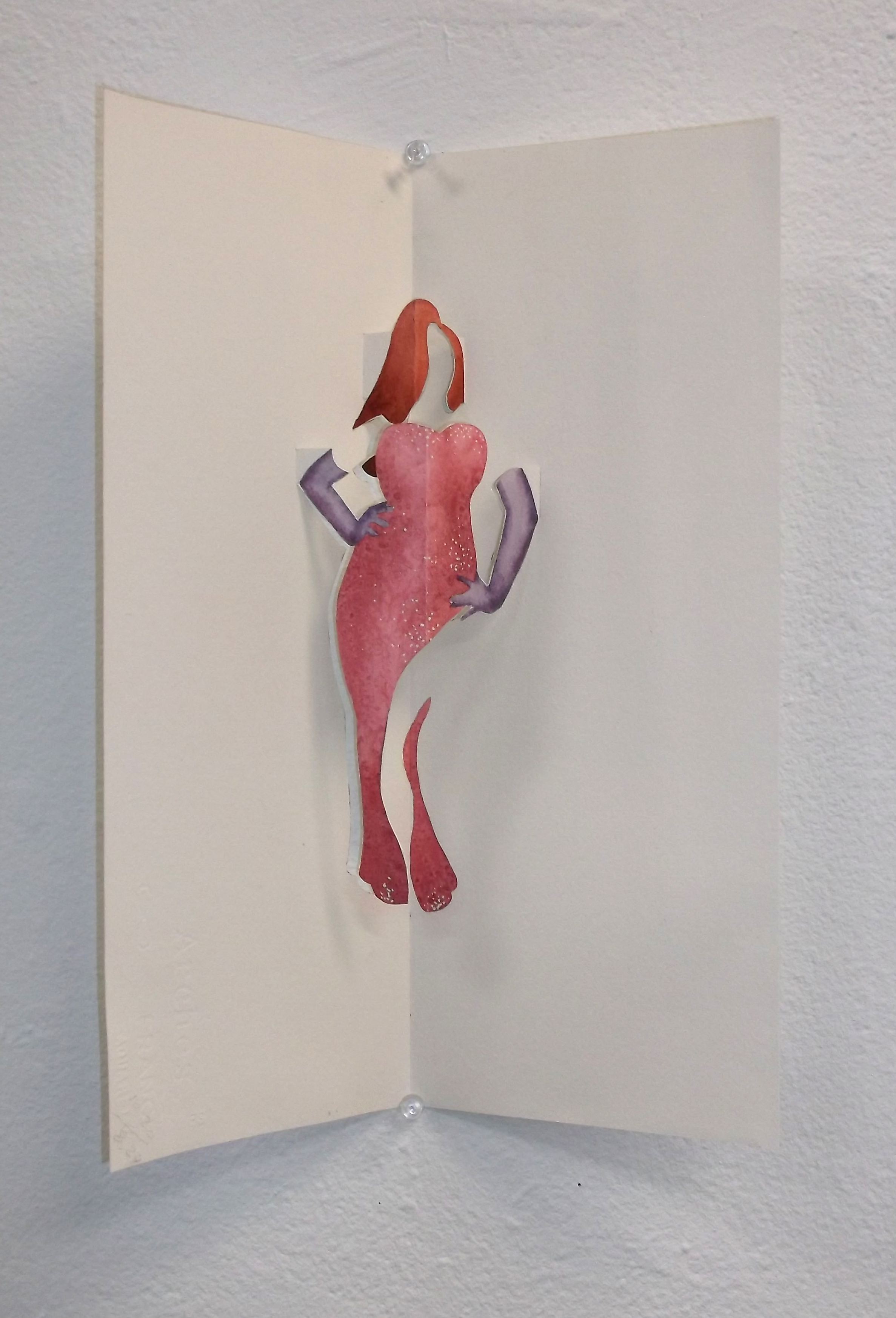
Verdict: nah
Like the court dress installation, this is a format that suits this idea but not the rest of the series. I do enjoy popups, and might make a few promotional popups from select costumes. Overall, however…no.
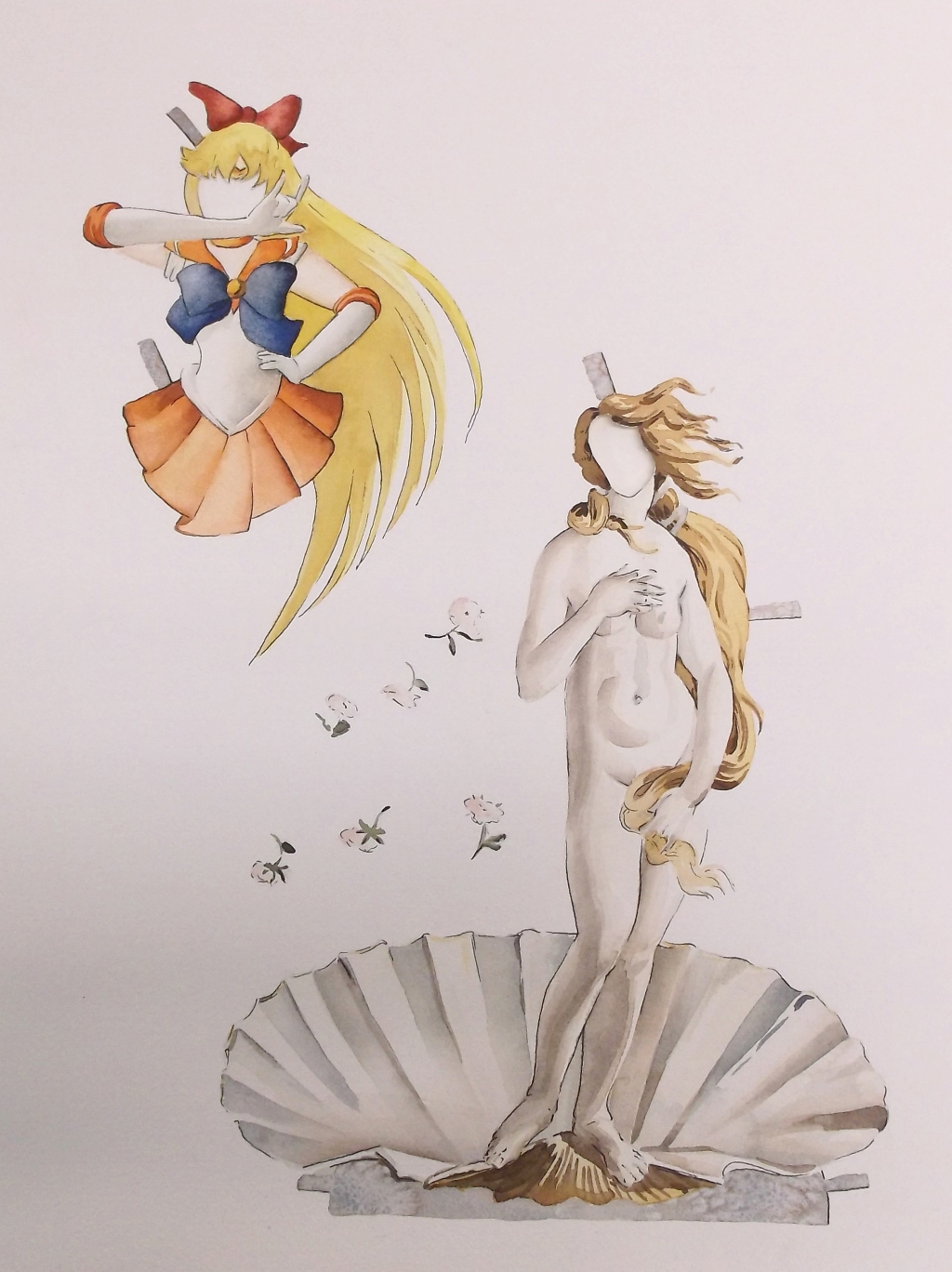
4) Venus Venus
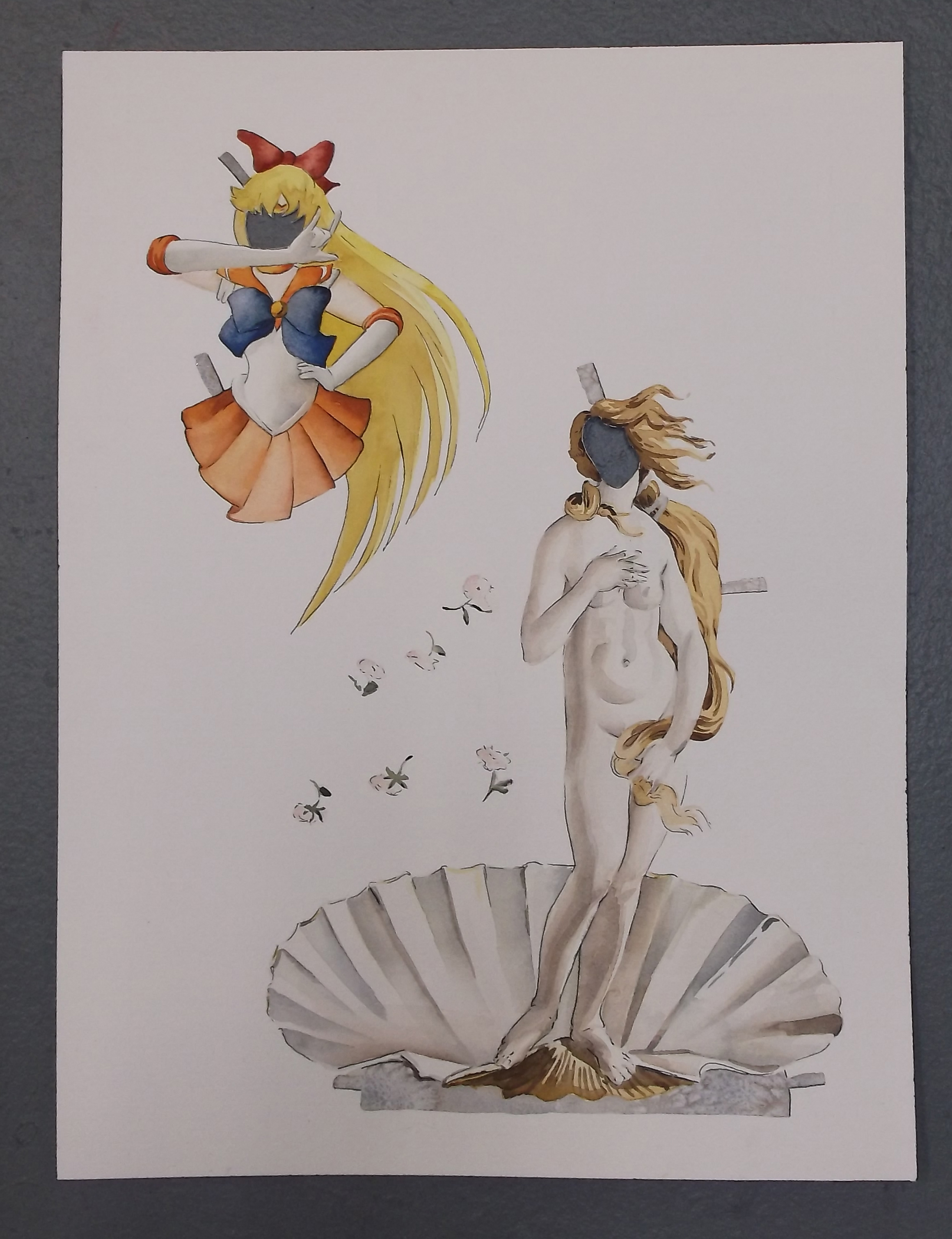
Verdict: keep going
Painting and playing with 2D images are more true to how I visually process ideas than the previous experiments.
That said, simply cutting out the faces was a pitifully literal way to approach applying subtractive means of expression (translation: cutting the paper) to this artwork.
Possibilities to explore further include:
cuts that reinforce the images (adding detail, helping parts project, etc.)
cuts that subvert the imagery (removing critical details, parodying them, or…well, I’m still working on this concept)
what should show through the cuts? (possibilities include other imagery, color fields, or the bare gallery wall)
Last night I made a pile of photocopies of my paper doll paintings. I lost track of time while messing around with them and an X-acto knife. I take that as a promising sign.
