The Crocker Art Museum signs got me thinking about how a museum’s signage reflects its values.
Just to review, a typical sign will look like this one from the Metropolitan Museum of Art:


The Met does good, clean signs. They prioritize the artworks themselves while providing substantial additional information. The background color of the sign matches that of the surrounding wall, which makes it relatively inconspicuous. The description gives a bit of context and plainly involved research. So far: good stuff.
The code for the audio tour is a little conspicuous, but that’s common. The attribution information at the bottom gives credit to those who donated the artwork, when they did it, and a museum reference number that means nothing to me.
I have mixed feelings about this.
I acknowledge that it is only proper to recognize generosity, and that doing so publicly encourages further generosity. I also know that precious few museum visitors will be interested in this information, and that what is (to most of us) white noise will encourage us to tune out all the other lovely information. Is this segment, then, a necessary evil (depending on the viewer)?
Here, now, is an example from the Crocker Art Museum:

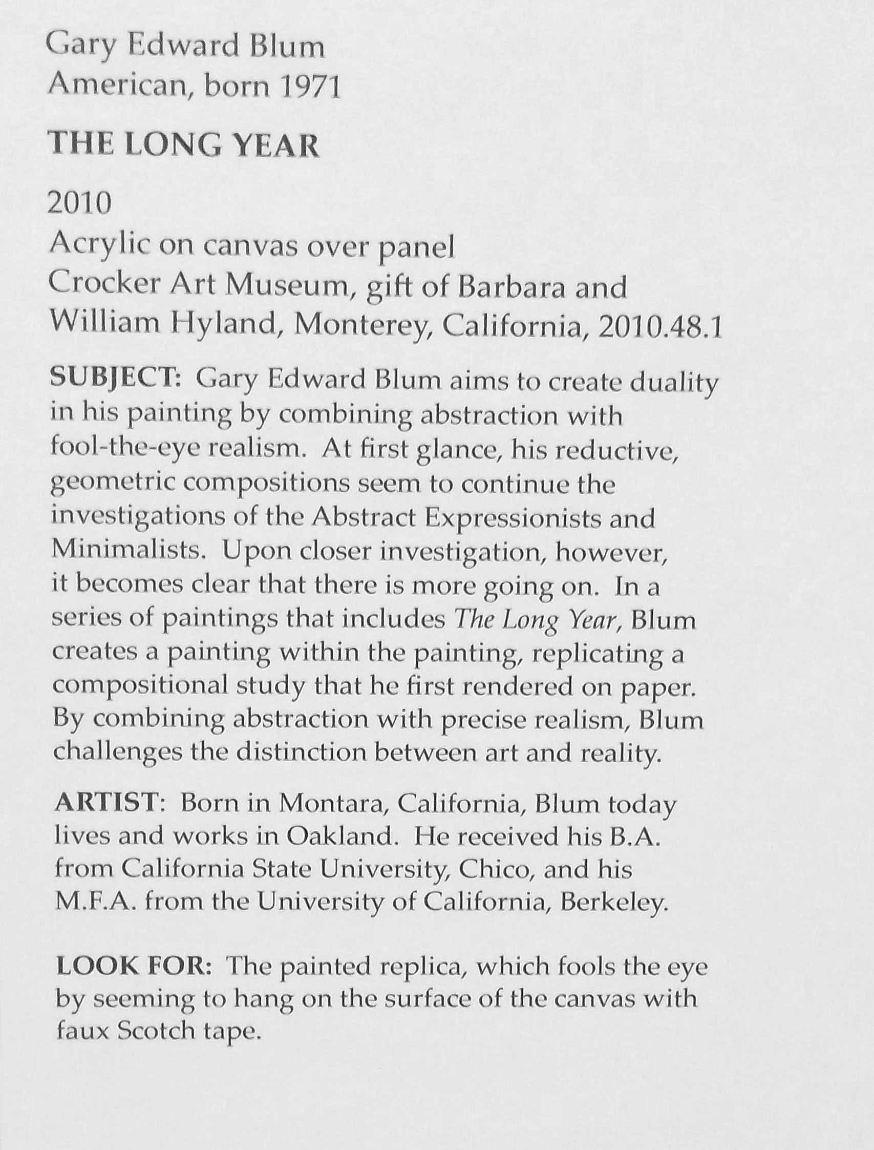
The differences I will point out relates to a few personal preferences. This format is typical of all the signs I saw at the Crocker: each had a separate heading to describe the “Subject,” “Artist,” and something to “Look for.” This format was standard, but each category got more or less space on a sign depending on its ability to increase the artwork’s significance to museum patrons.
The writing tone similarly balanced professionalism and inclusiveness. In the sign for Gary Edward Blum’s The Long Year, notice that his artwork is described as “fool-the-eye realism” rather than trompe l’oeil. The latter is the more academically respectable word choice, but the former reflects the fact that a museum needs both specialist and non-specialist patrons.
“Look for”
This was one of the artworks for which the “Look for” section was particularly useful. I (appreciate but) do not revere abstract art, so I didn’t plan to pay much attention to this painting when I walked into the room.
Luckily, my initial cursory glance included skimming the sign. This closeup shows the bare hint of paint strokes that pretended the smaller black rectangle was “taped” on.

I laughed my head off.
Trompe l’oeil painting has an undeserved reputation among some artists as being less intellectually rigorous than abstraction. This perception is ironic because extreme realism requires an equally profound double-think. (You can’t paint that realistically until you develop the ability to cease seeing forms as things. The process of realistic painting highlights the fallibility of vision.)
The artwork was sneaky and hilarious, but I would have overlooked it entirely had that sign not given the game away.
Often such signs in the Crocker directed attention to subtle details. Sometimes that “Look for” tag simply pointed out stylistic affiliations.
Overall, it emphasized things that the viewers could discern without prior knowledge. You may not know about realistic painting and abstraction, but your average museum patron knows what tape looks like.
This category struck me as a refreshingly egalitarian note for an art museum.
What about the categories as a whole? Don’t they dumb it down?
No. When you try to break art down, you see how complex it is and how impossible it is to truly break it down into categories. These “categories” parallel the way I analyze art. As an undergraduate art student, I was required to study something my professor termed the hermeneutic circle of art.
We didn’t read Martin Heidegger’s “Origin of the Work of Art” at the time, but the idea is similar.
[ As an example of Heidegger’s hermeneutic approach to art, consider the following:
“The artist is the origin of the work. The work is the origin of the artist. Neither is without the other….As the artist is the origin of the work in a necessarily different way from the way the work is the origin of the artist, so it is in yet another way, quite certainly, that art is the origin of both artist and work” (1).
These statements contradict one another, but truth is paradoxically present between the lines. ]
You can’t discuss (or justify) the meaning of an artwork without being able to explain what about the artwork led to that conclusion. They are inextricably linked. You can try to describe just one of the following three categories, but you’ll end up discussing the others as well…even if just by what you choose to describe or omit.
At school, we were led to discuss art in terms of subject, form, and content. The extreme distillation of these three was:
WHAT you see
HOW it came to be
WHY it exists (or why it matters)
The WHAT/subject category includes any name you can apply to what you see. Do those marks suggest a human or a landscape? Is it a particular person? Has the artist intentionally avoided recognizable subject matter?
In the HOW/form theme you discuss physical characteristics of the artwork. This is the time to talk about mediums. Does it correspond to a particular named style? If you just said that there is a figure, which are the marks that you read as signifying a human?
Finally, the content/WHY of an artwork refers to the conclusions, emotions, thoughts, associations, or reactions elicited by the former two categories. Did the artwork have a particular religious or political significance? What is its historical context? How has it affected people and art since its creation?
Why did we just get into hermeneutics?
I find the concept of hermeneutics extremely helpful when writing or speaking about art. If I can’t explain how I came to a particular conclusion, then my assertions rely entirely on personal charisma.
The subject/form/content format I just mentioned can seem a little simplistic. Heidegger’s hermeneutics and frequent references to the “thingliness of things” also sounds a touch absurd in English, but he certainly owned it in his essay.
The signage format for the Crocker Art Museum had an obvious formula, but that formula made information readily accessible and validated the artist who made the work, the content of the work itself, and the role of the viewer.
Good stuff.

One response to “Museum signs”
[…] because they are opinions about something that affects a lot of us. I mentioned Heidegger’s hermeneutic circle before. It still […]