A summary of a summer of studio work (in reverse chronological order):

I’m rather interested in the idea of combining rendered and linear elements in painting. This painting was barely dry in time to ship home at the end of the summer session.

I’m not particularly enraptured by gore, but there’s something about seeing your own head on a platter.
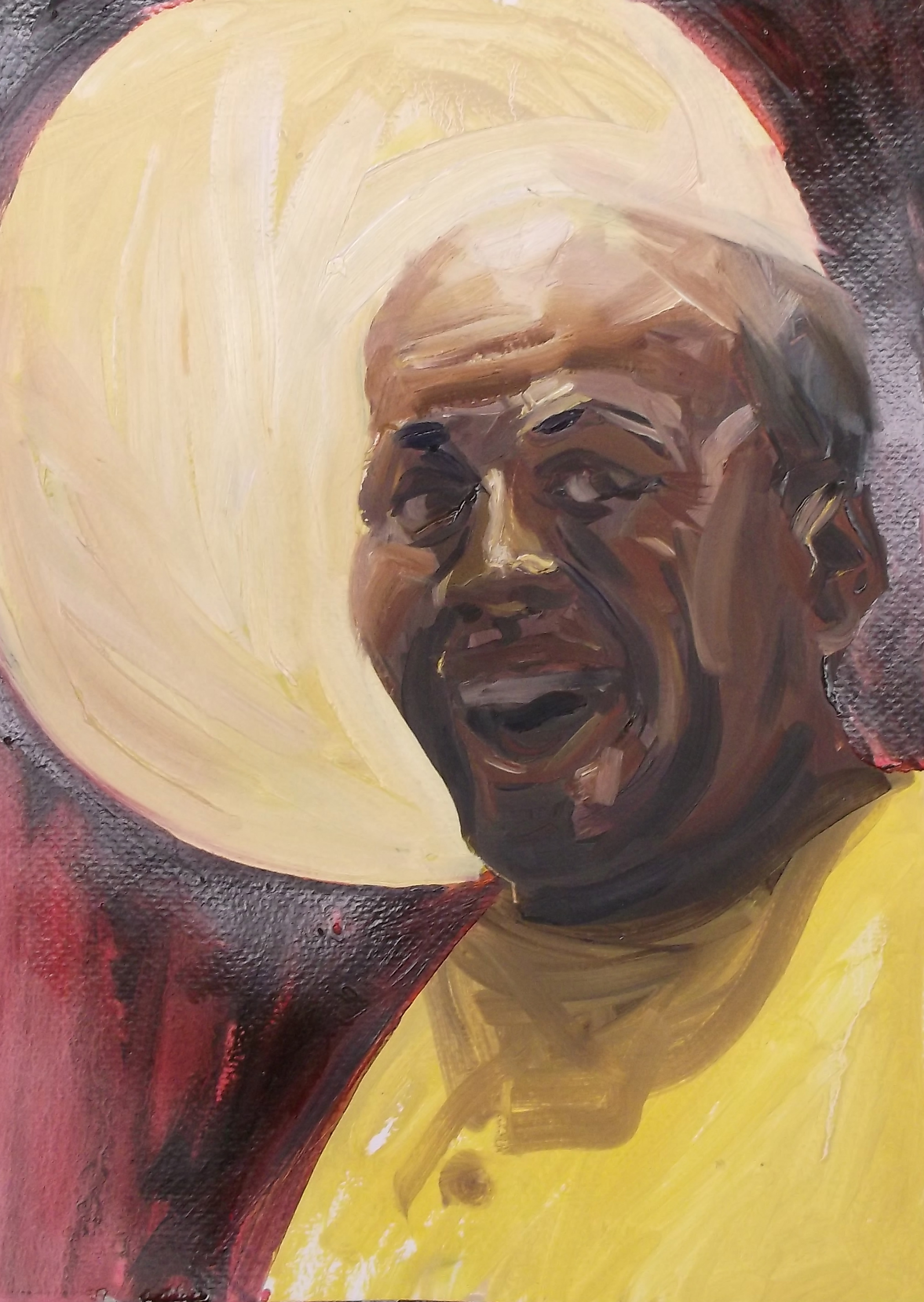
Near the end of the summer I toyed with the idea of doing a series of backlit portraits with halo elements. I keep circling back to this idea, but now is not the time.
[There was also a short film interview for which I did a bit of graphic design. Film isn’t really my medium.]


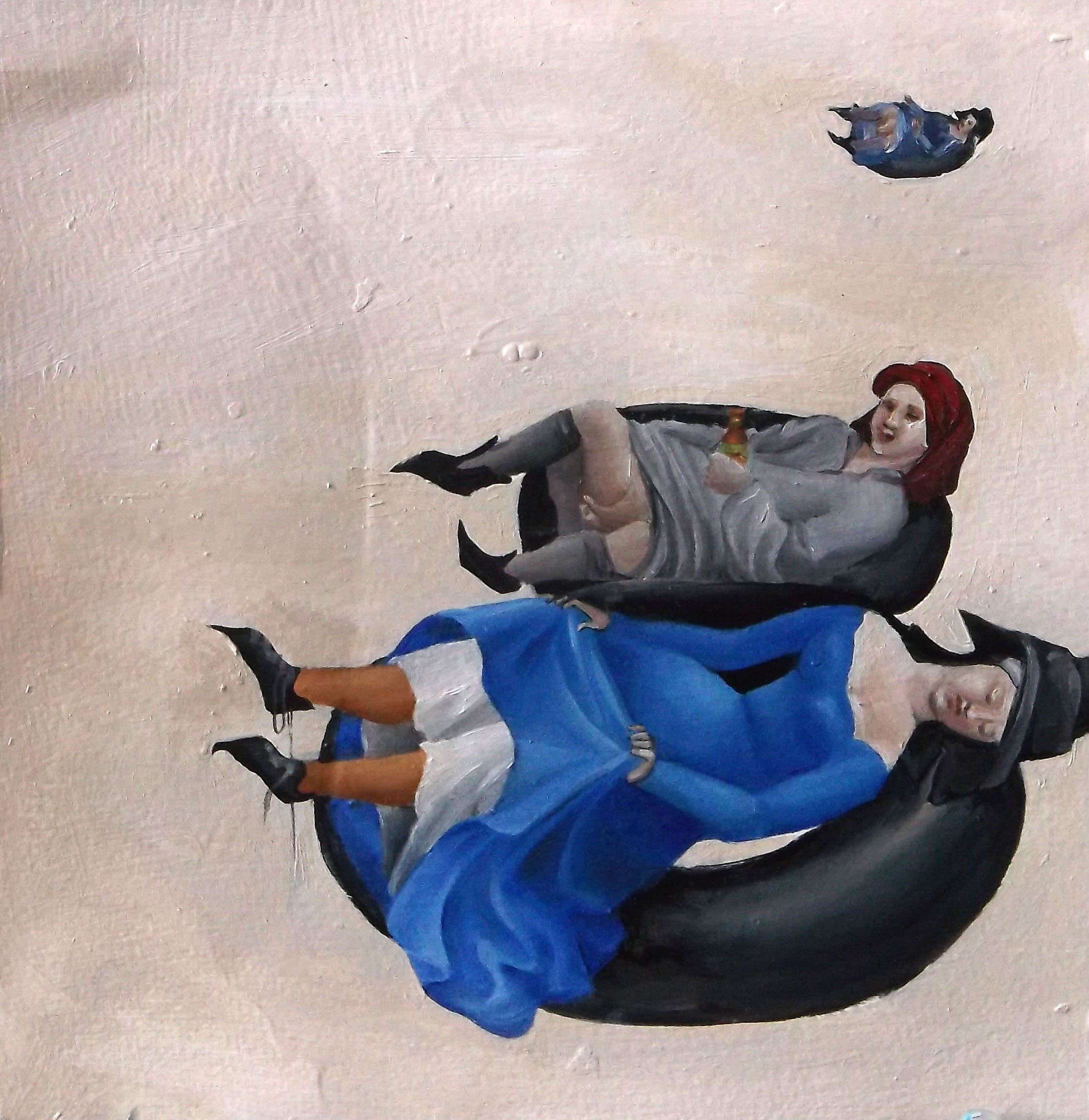
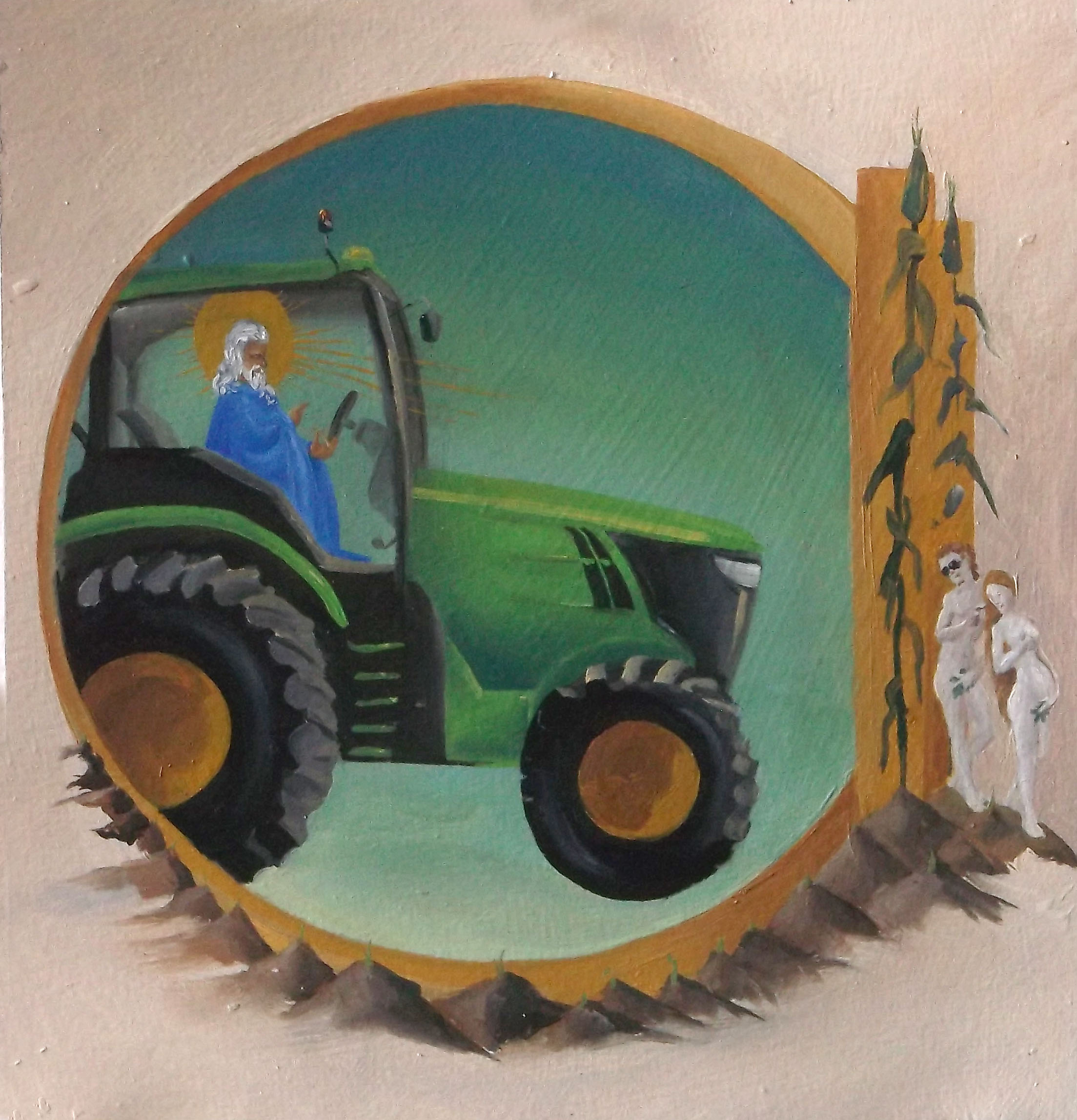
I’m still experimenting with how best to talk about this project. I got odd looks from several people with whom I discussed other ideas about how to satirize van Eyck’s Arnolfini Portrait, but those ideas will have to wait for other canvases…because this is complete as photographed.
![]()

Technically, this was part of the Studio Topics seminar. A lot of my preparations took place in my studio, so I’m going to count this stencil, the woodcut and photo-transferred postcards, and the rest of it with my mental tally of artistic endeavors.
This coin design refers to Erin Boyle’s collaborative project in front of Hamilton Hall. I used this prototype to make her a wax seal (complete with handle). It was also the basis for the altered book I submitted to the concomitant show in the President’s office. I somehow forgot to document the altered book, even though I was pleasantly surprised by how it turned out.

More pictures and description of the wax seal project and subsequent installation are here and here. I have over twenty different seal designs so far, and am still fine-tuning my wax and color recipes. The project also involved researching and considering mail art, collaboration, humor (especially the ethics of pranking), and calligraphy. This line of art-making continues to intrigue me, so expect to see more experiments with wax seals and correspondence art in the future.


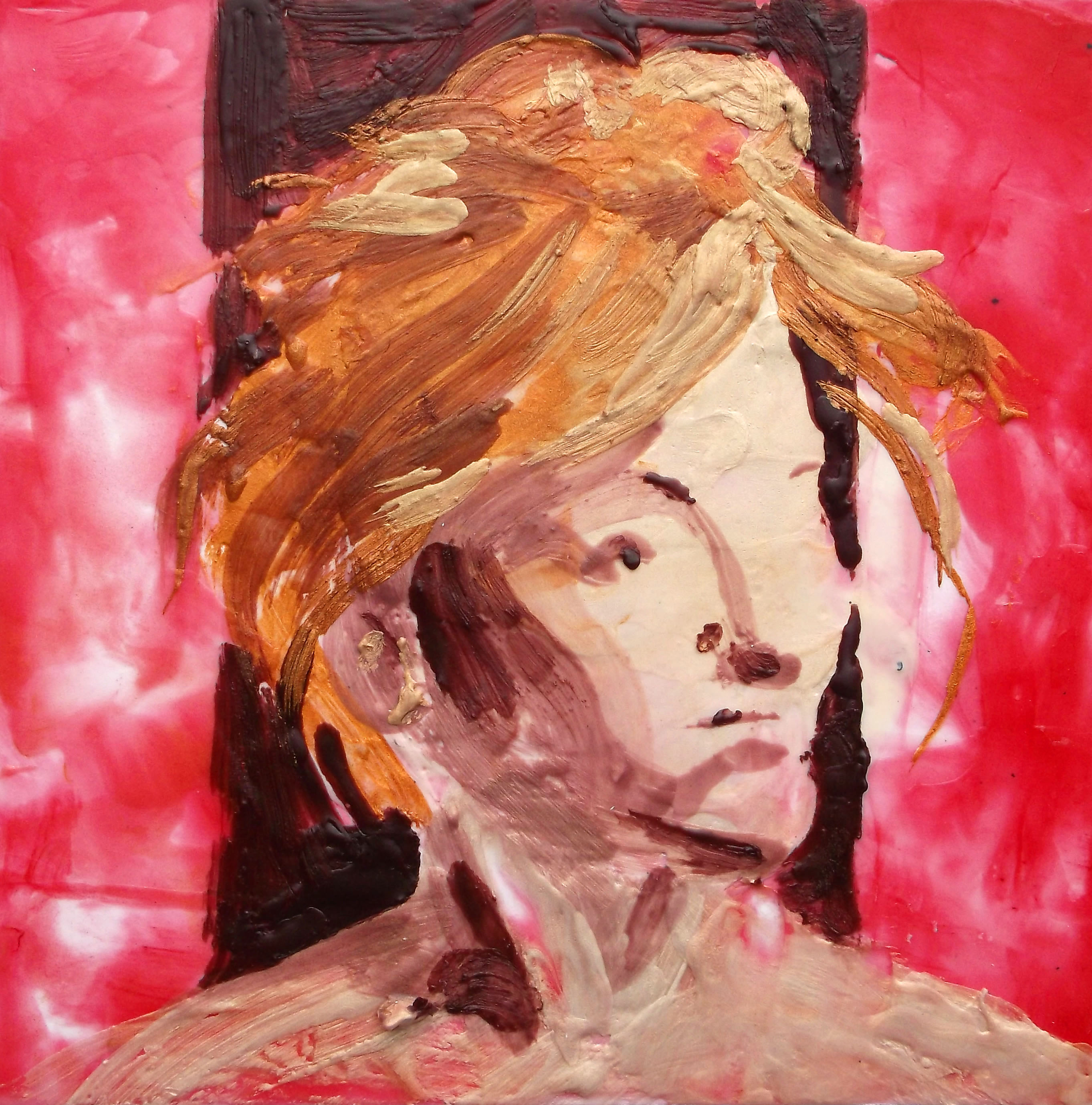

I enjoyed the spontaneity of encaustic painting; in many ways it reminds me of watercolor (but with the added option of opacity).

I painted these three miniature parodies with the intention of binding them into a book and altering it to make an e-reader case. The idea is good, but ignores the fact that I don’t care to do bookbinding at that level.

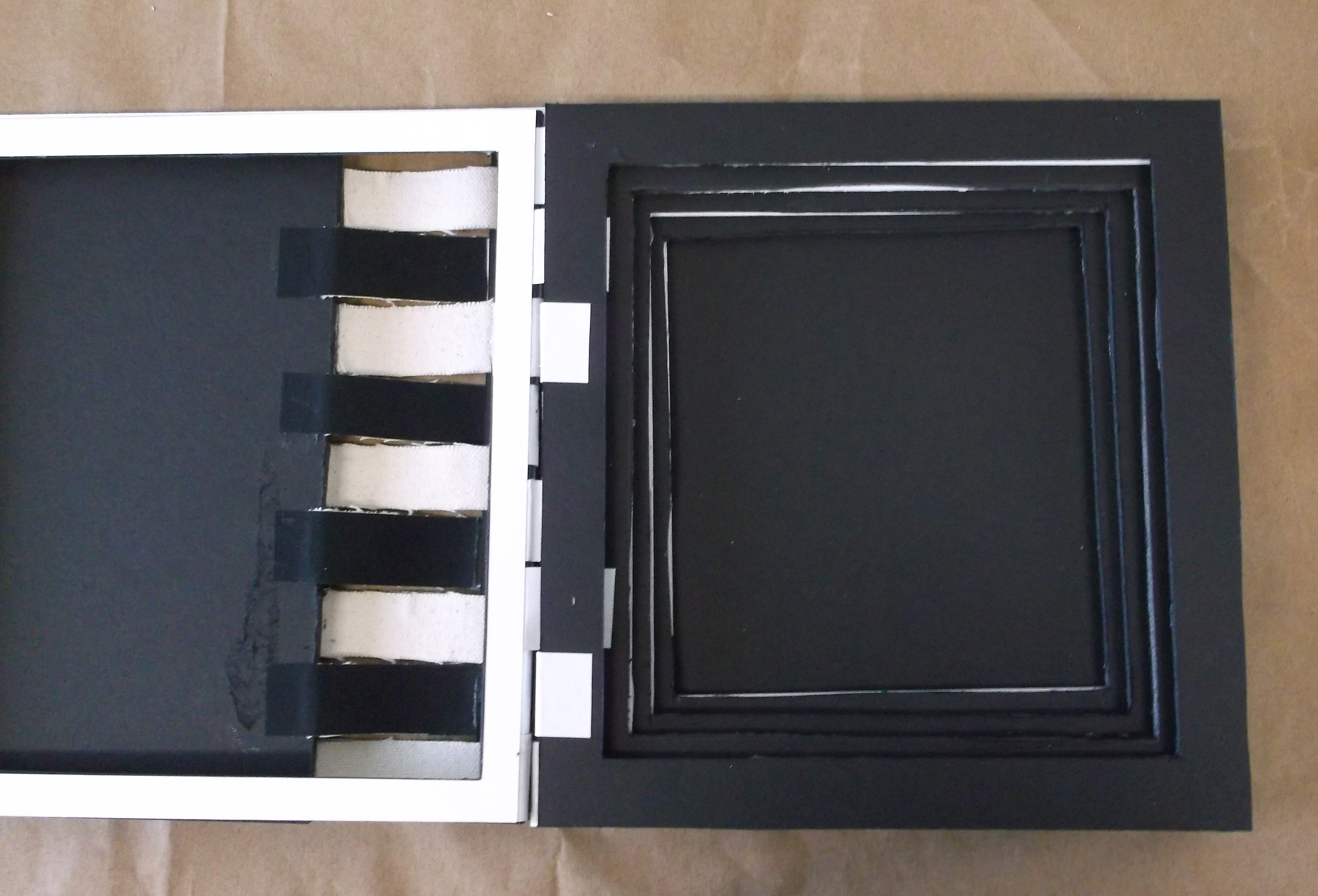
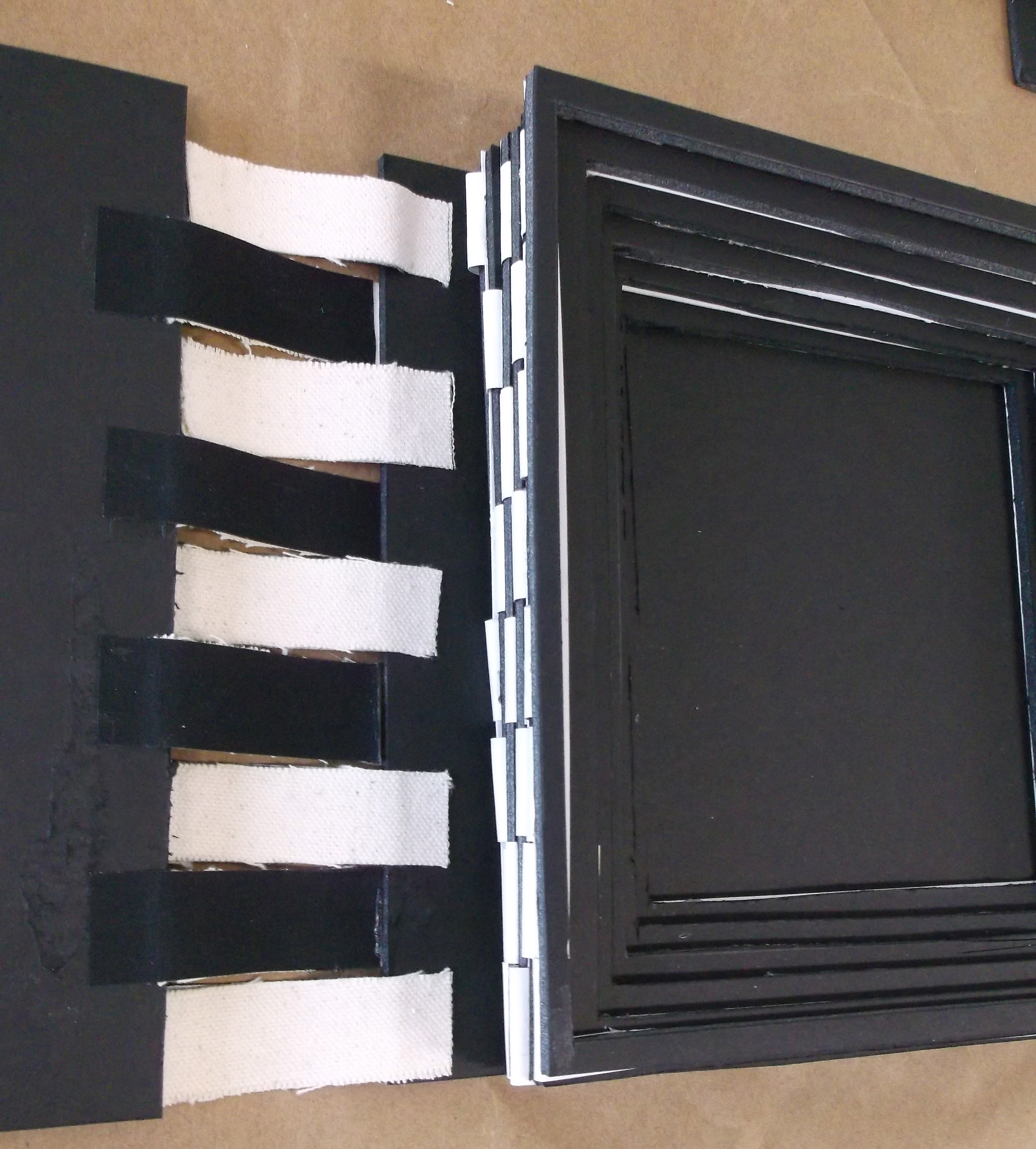
These were foamcore mock-ups of the e-reader case I proposed at the beginning of the summer term. I wanted the e-reader to be housed in something that imitated altered books. It wasn’t a popular concept.

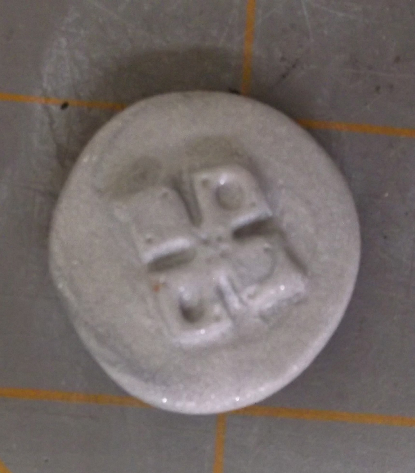
These coins refer to the supermoon which we enjoyed during the first week of our summer session. The lighter coins glow in the dark. I proposed doing a series of the coins (with a new design each week), but there was a resounding lack of enthusiasm or interest. Just as well, since they’re a lot more work than they ought to be!
